🇵🇹 On Tour IV – Cover/Jingle
本日はお集まりいただきありがとうございます。
It's less than 2 months now to Summit On Tour IV – and as we start with the whole communications cycle, the time has come to explain how the 🎨 cover art came to be, as well as to present to you the 🎹 jingle of this edition.
それでは、早速ですが、本題に入りたいと思います:
The Artwork
As you may know, each of the recent editions of the Summit gets its own key art. For the main event, we focus on a single idea, such as 'coming to grips with the excessive regulation' for Summit IX or 'a diverse community that looks after each other' for the anniversary Summit X.
For the On Tour editions, we rather look for an expression of the locality first and foremost. The 🇵🇱 Warsaw edition had the Mermaid of Warsaw as a video game character, the 🇨🇾 Limassol edition featured the dove of Cyprus treated as a platformer screenshot, and the 🇮🇹 Rome edition retold the story of the city's founding as if it were a cover for a space game, drawn in the style of a fumetto.
Once we decided on Porto as the venue of Summit On Tour IV, we started with the following brief:
[5:43 PM] Porto's boats: the shape of the boat is recognizable enough. classic colors – yellow/red – plus the form, should seal it.
[5:48 PM] It's an invitation to visit Porto to… spend time together, catching up? maybe we see people engaged in a conversation?
[5:52 PM] A night-time boat, with the interior lit up? Futuristic? So it’s a combo of traditional form (boat) and future content (cyber)?
We wanted the art to say: come to Porto, engage with the community. Enjoy the rich culture of centuries past – while discussing the industry that's our future.
The Mood Board
The next thing that happens in the creative process is the mood board. These days, it takes a bit of an effort to filter out the (mostly misleading) LLM-generated content from the search results ('empty calories').
Here's what our artist, Aurélia Folch, started with:
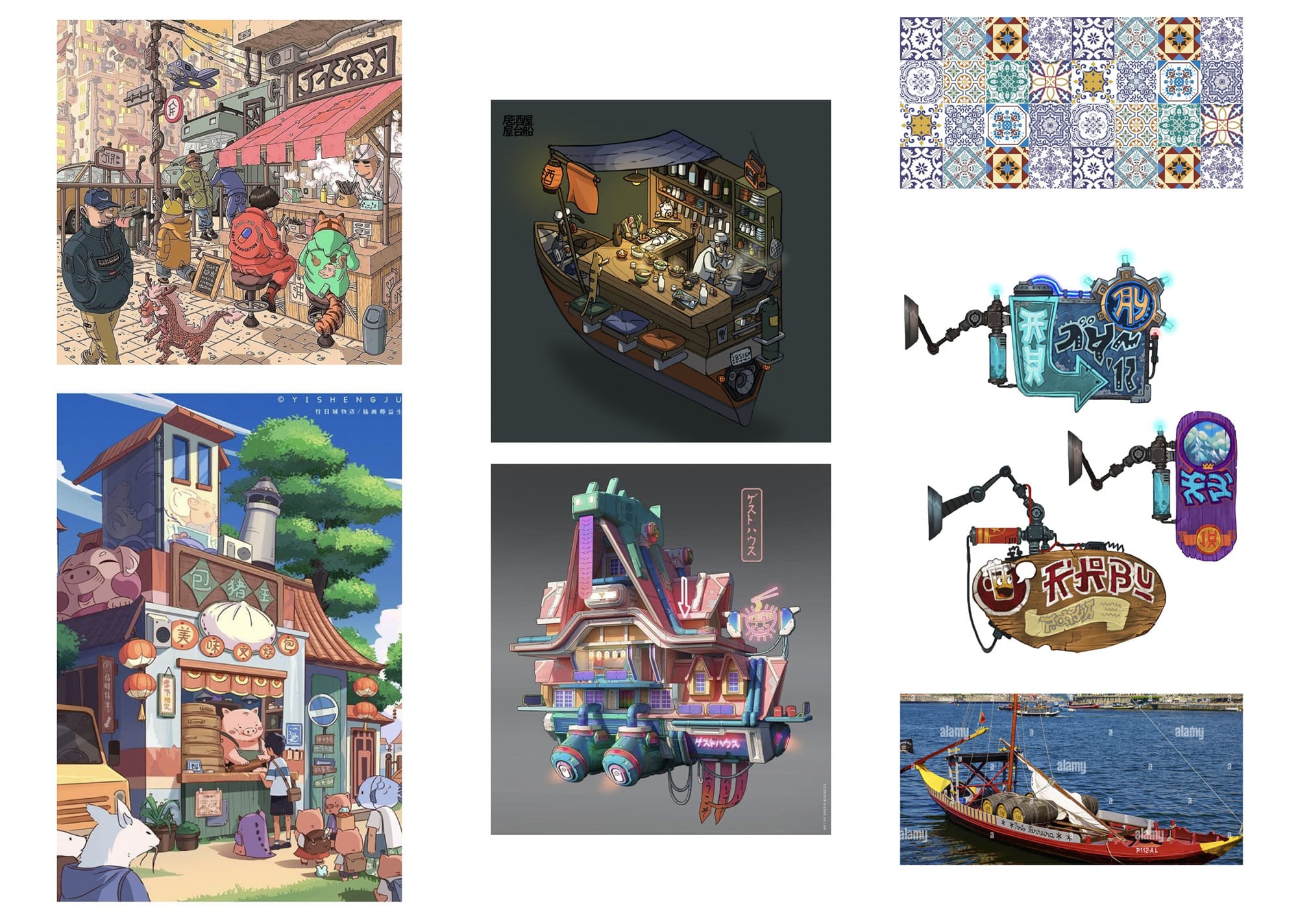
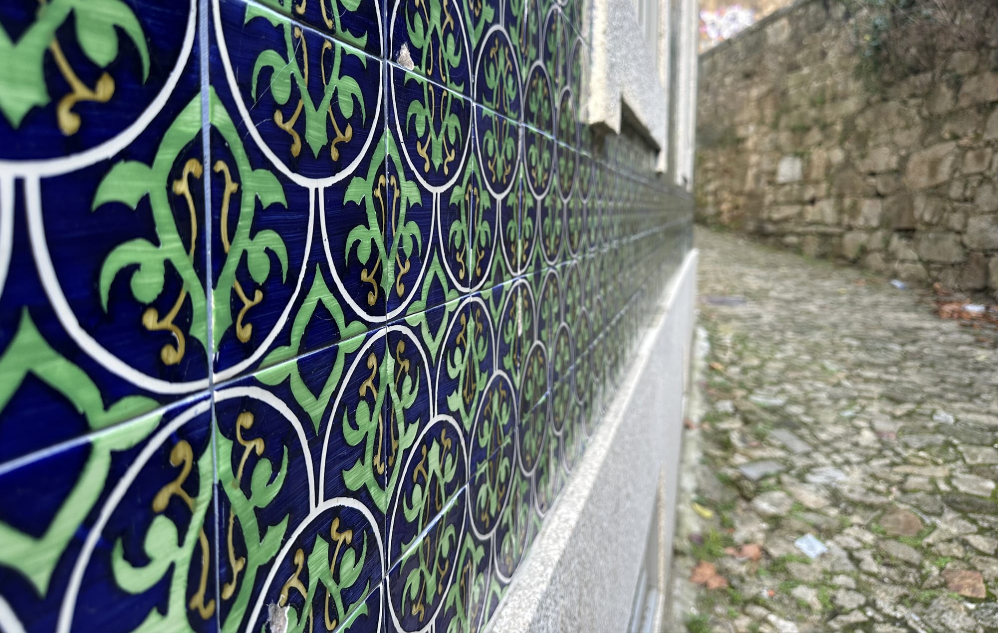
Even if you haven't been to Porto, you probably recognize the signature boat (Barco Rabelo) and the ceramic tiles (azulejo).
We had to decide if we pursue something static, or a boat that's up in the air. We opted for the second option:
the boat will represent the community, the central point of the whole thing – where people are coming to – while also serving as the restaurant, a place of sharing, a place of hospitality.
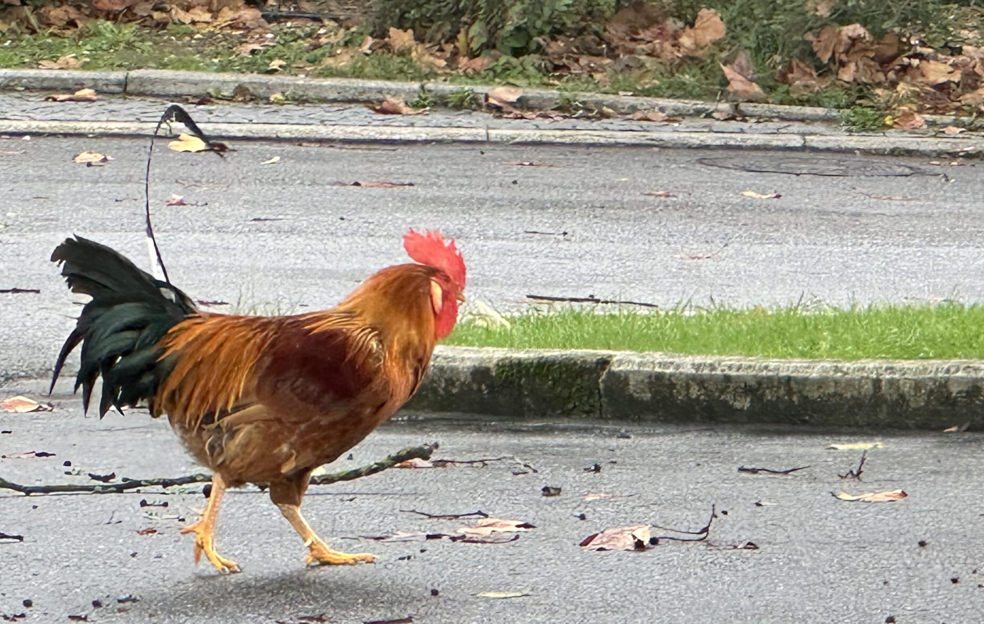
At this point we also realized that we want a rooster, another association with the locality: (1) we're going to Porto (boat); (2) to spend some time together (break bread); (3) the hosts are local (rooster motif); and (4) the setting is games-related (cyber/futuristic).
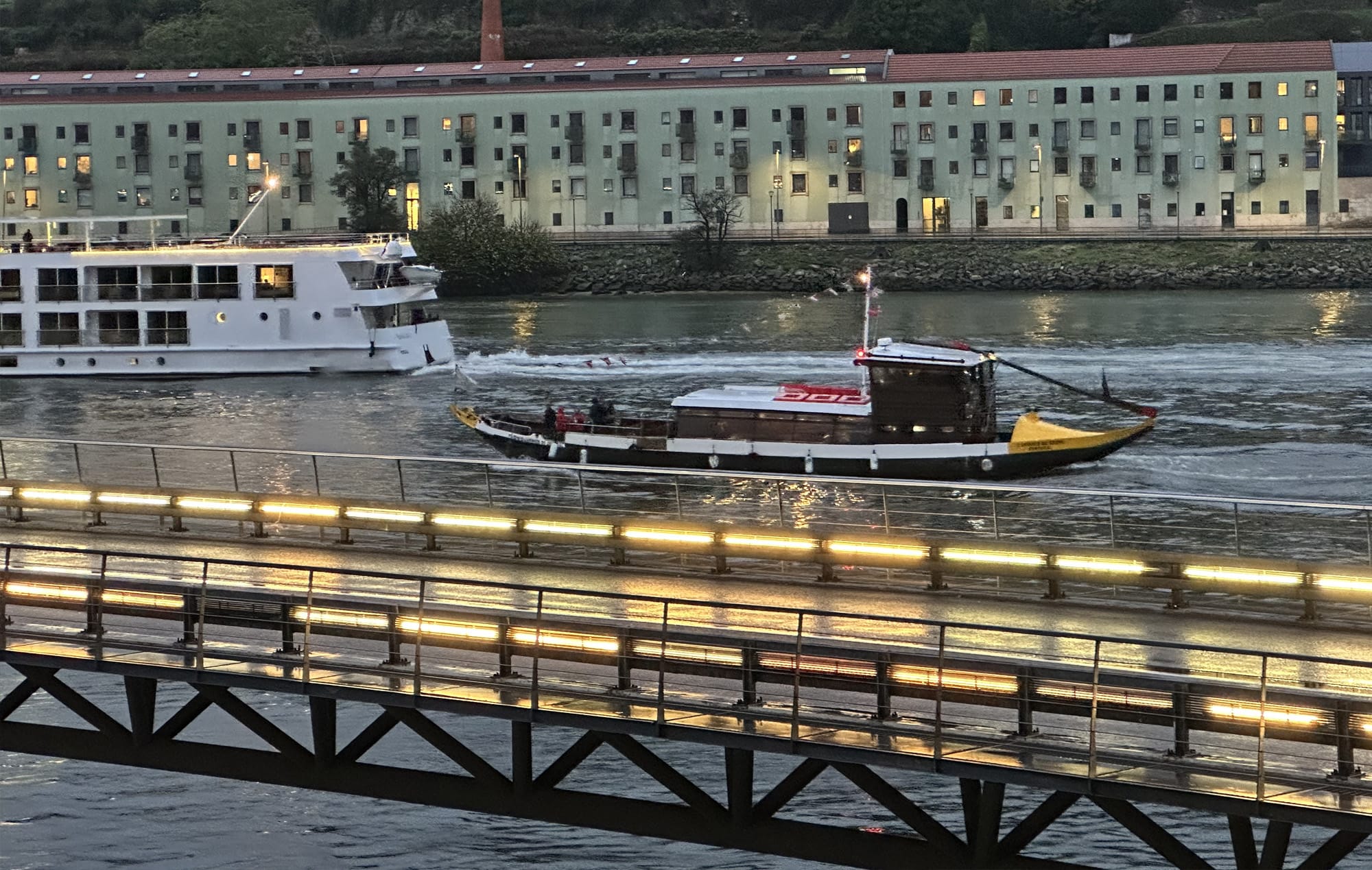
Several months later, when I was in Porto to scout for the venue, I was so happy to see that we made the right choices – plenty of Rabelo boats:
Azulejo tiles on every street:
And yes, the roosters. At the Gardens of Palácio de Cristal, I ran into a few:
The First Sketches
The first sketch is always a touchy issue, especially when we work from different time zones: the artist uploads it to Slack, and goes to sleep, to find our feedback in the morning. Is this a "YES!", or do we go back to the drawing board? In this case, the concept clicked:
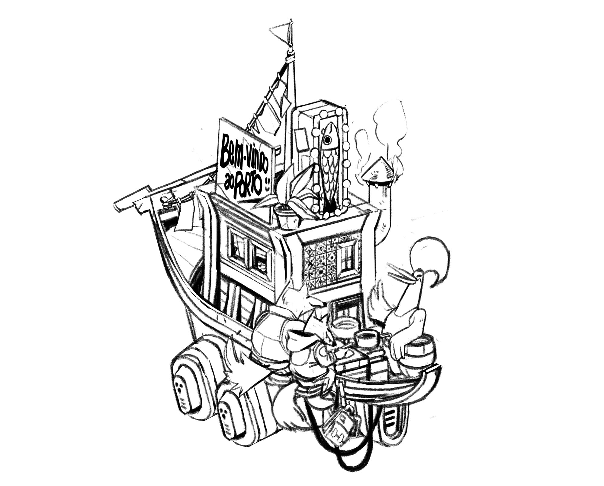
Two wolves (fellow counsel) having some soup at the boat-turned-restaurant, served by the rooster – with a sign in Portuguese, and some fish to nail it. We decided to proceed with the colors, adding the Portuguese flag at the top:
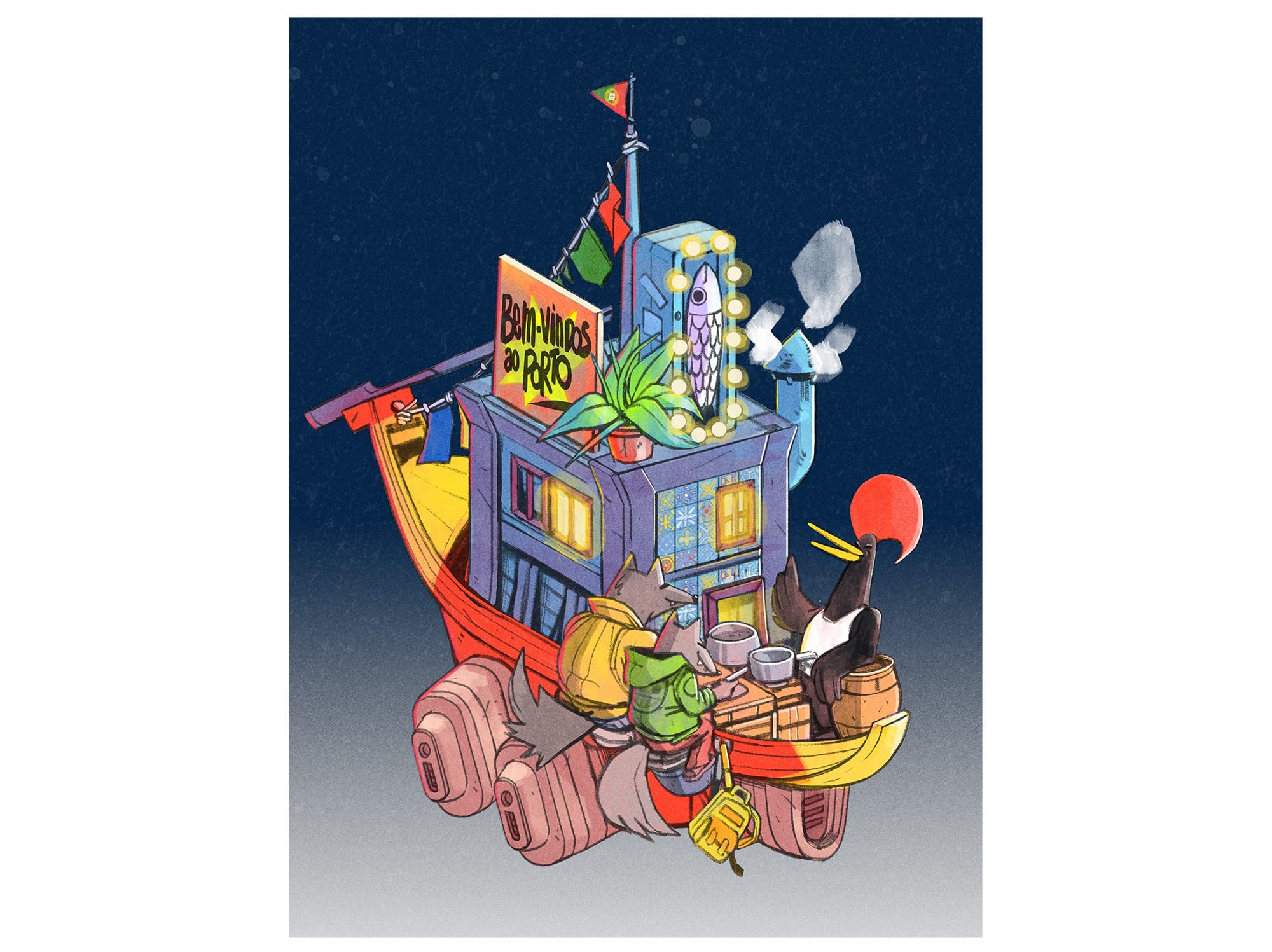
Now, this wasn't bad – but it wasn't great either, as with too many colors, we lost the focus.
Too many things happen at once here: it looks like (I beg your pardon) a generic game on a popular social network 🙈.
The Tweaks
We started with the transition to a night-time setting; as our community members may confirm, a lot of valuable insights are shared once the sun sets down, and the rooftop bars:
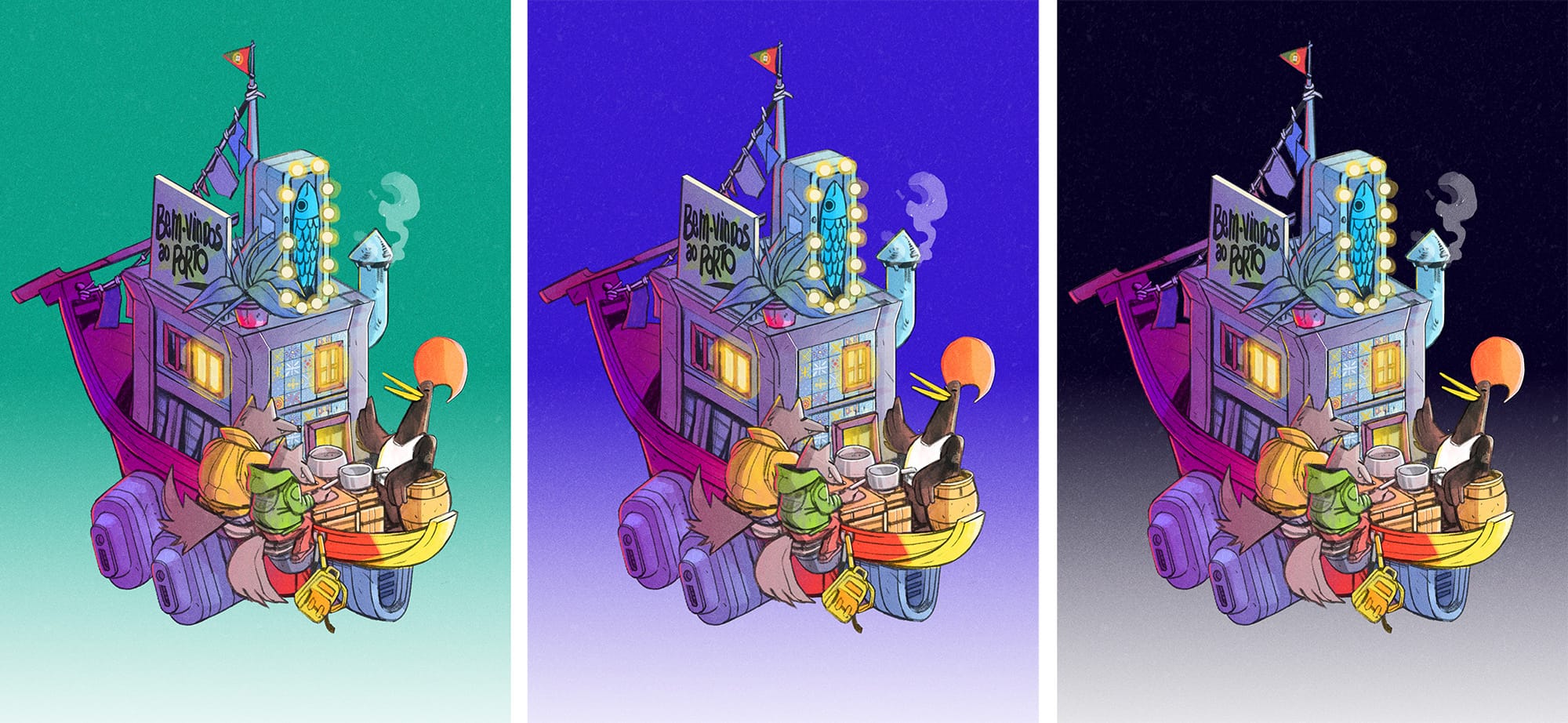
At this point, the background color was still a distraction, so we OK'd the night-time setting – but agreed to push back the decision on the background to a later stage.
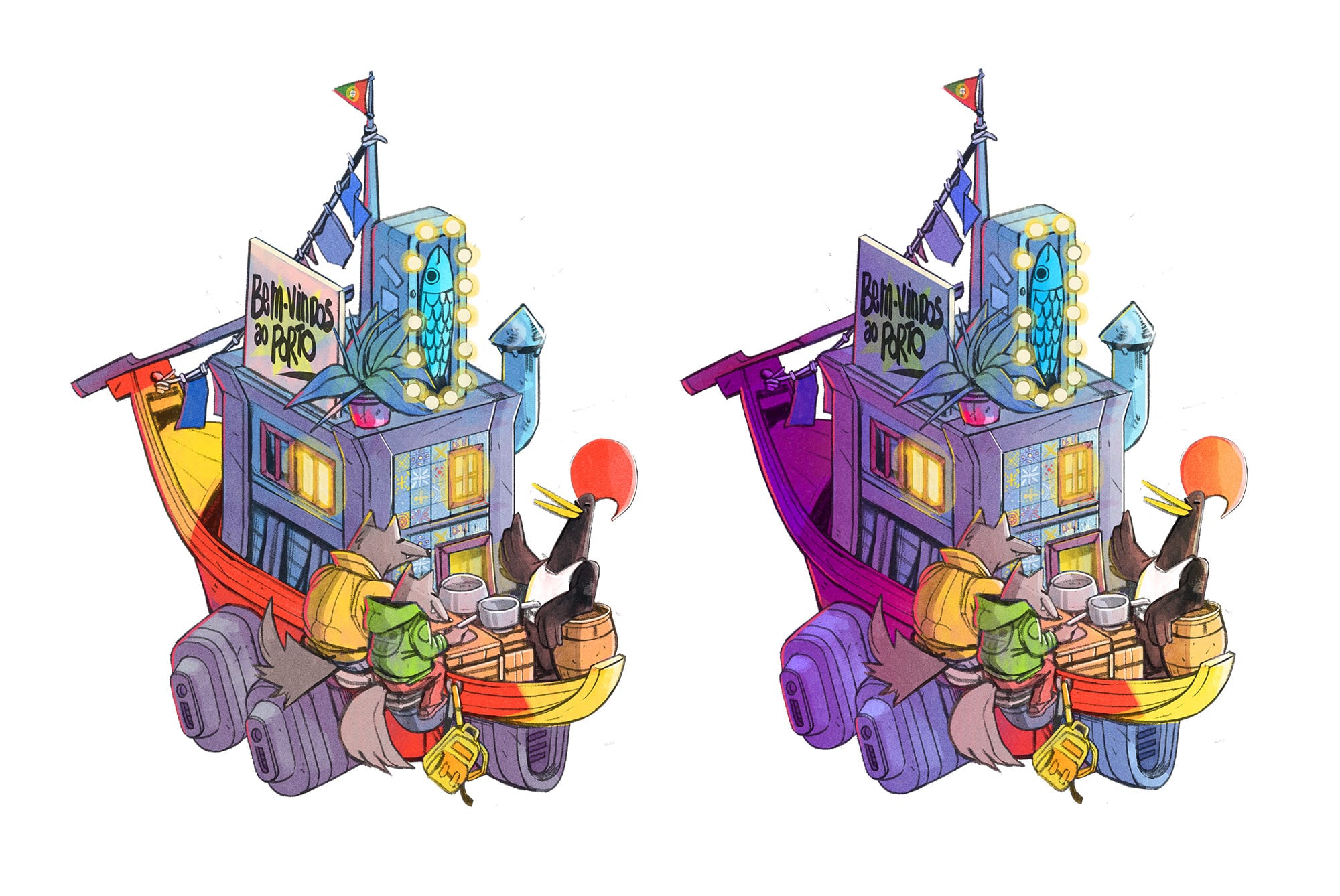
I don't know if you notice a problem here? 2 issues:
(a) The counsel in the green jacket is somewhat sad. Perhaps they are from Moscow, or Tokyo, where people are more reserved in general, or perhaps they have a draft to redline later in the night; either way, here, they seem excluded from the lively conversation of the other counsel and the Portuguese chef.
(b) The counsel in the green jacket has a backpack that belongs to a high school. Yes, we plan to discuss protection of minors. But no, we're not going to have any high-schoolers at the conference.
We started to look for better engagement between the two characters.
On the left, the American counsel is probably saying 'our litigation budgets are in the millions'; and on the right, the Asian counsel is probably thinking 'but ours aren't...'.
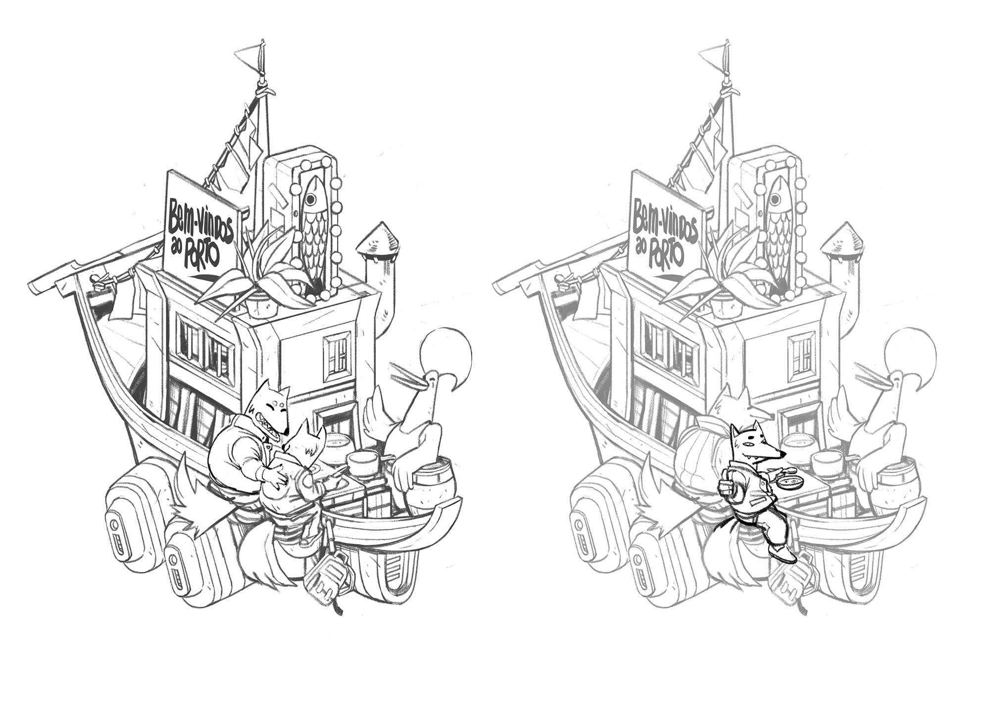
In the end, we removed the high school backpack, and equalized the counsel characters so that they would both appear equally engaged with the local chef in a manner that's culturally-neutral. And with that, we moved on to tackling the signage.
The Signs
Up to now, the sign on the boat said "Bem-vindos ao Porto" – another location marker, in addition to the boat's design, the rooster, and the flag on top.
I felt like it's too much, and meanwhile the art was missing a key part of the whole message: all the people who will gather, will come from diverse cultures and regions; and the things we will discuss, concern the global games industry.
We wanted to replace the sign with the name of the city, Porto, in Japanese (ポルト) or in Mandarin (波尔图) (Japanese as the proxy for "the legacy of the video games", Mandarin as the proxy for "the future of the video games").
And thinking about Japan and fish made me think about Hokkaido, and in turn about Sapporo Beer, and in turn, about the sign you sometimes see at the local bars there: a star in neon.
So, out with the painted fish – in with the neon fish and the star!
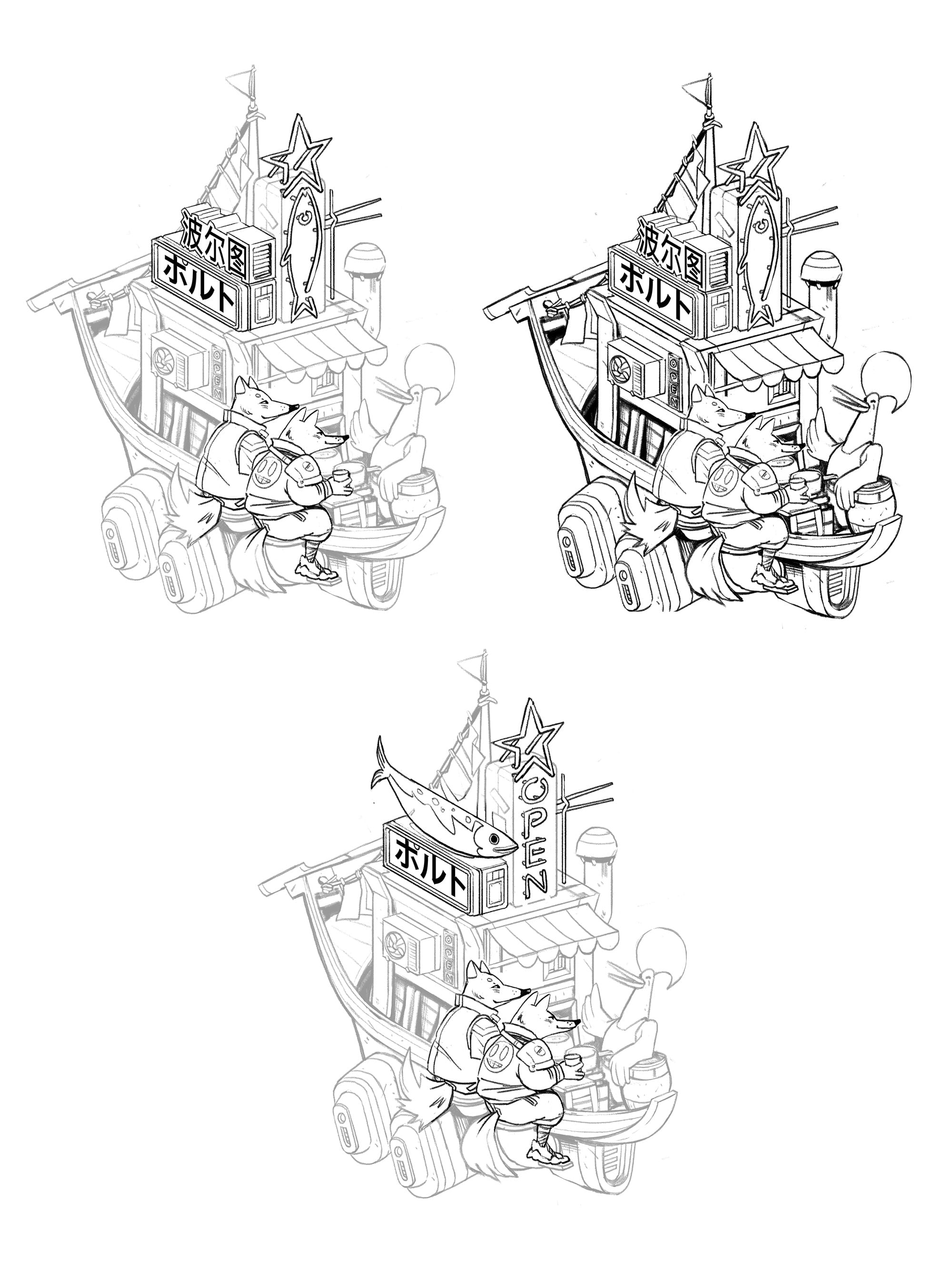
The star in combination with ポルト was too much (let's save it for Summit On Tour in Sapporo, shall we?), and we settled on the name of the city in its native spelling – plus the same name in Mandarin, and the neon star-and-fish.
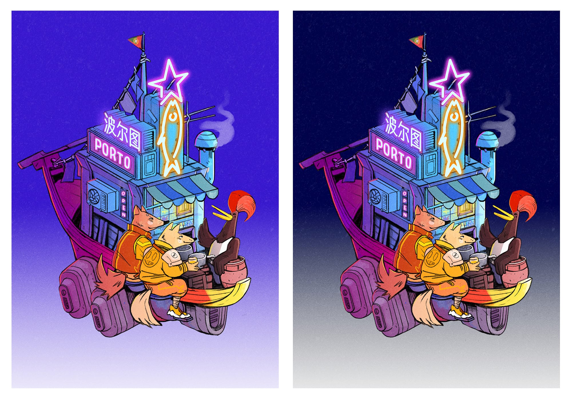
What's missing here?
Try to spot the difference between the drafts above, and the version below:
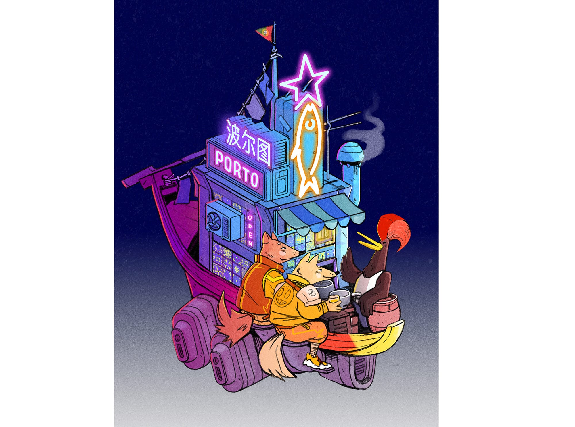
(The answer is: some more azulejo under the airco unit; because these are literally everywhere you go in Porto, and they are beautiful).
The Title
Done with the artwork, and onwards to the title: as usual, we asked Natasha Efimova, the lettering expert, to help us with the title of the conference.
The first idea was to mimic the 'stencil lettering' from some of the porto bottles –
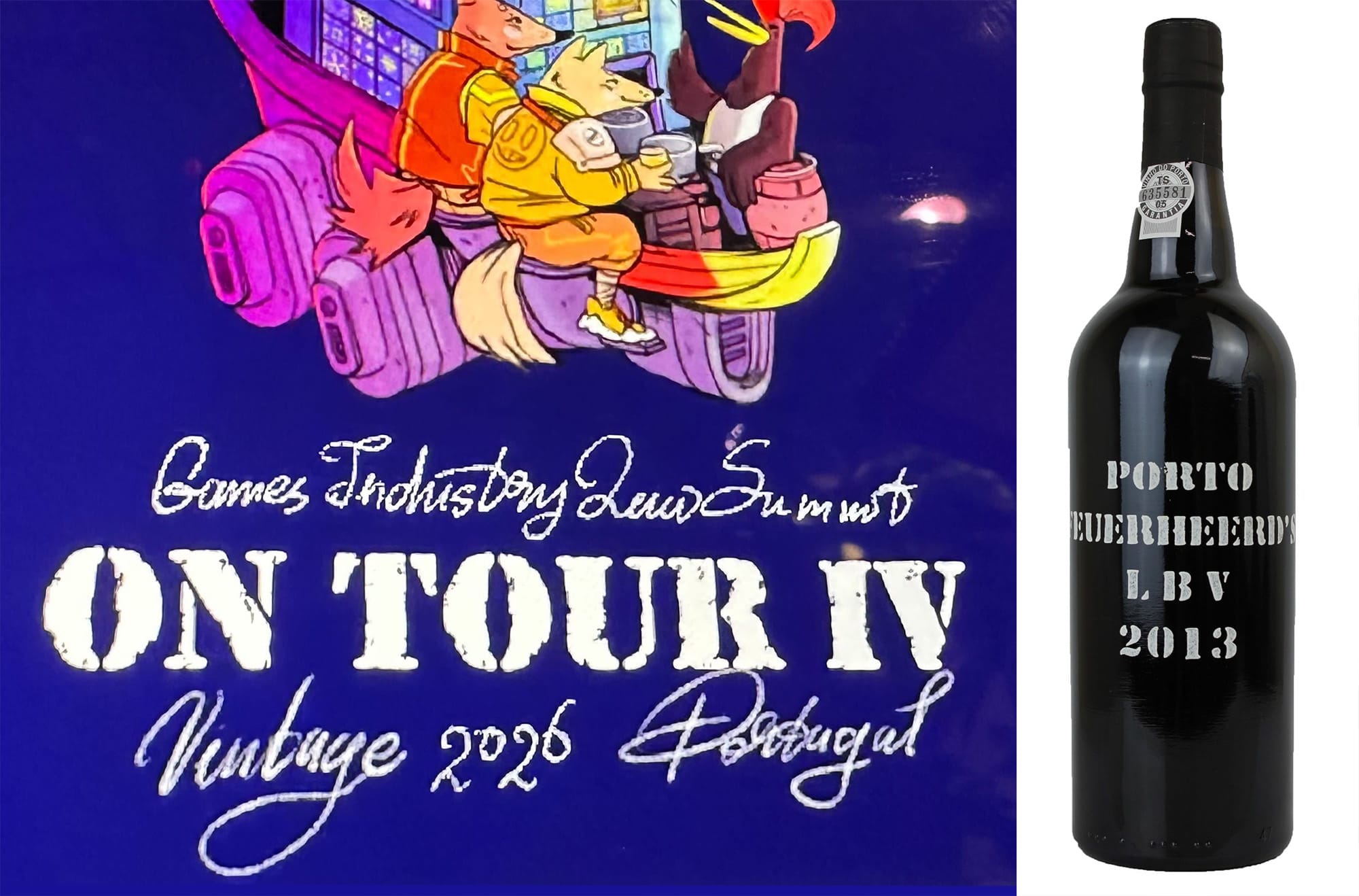
It was a bit too complex, though.
On a quest for authenticity, Natasha even produced the actual stencils (it's not a stamp, it's a cut-out over which people apply the paint – on the bottles, or on something else). It was better...
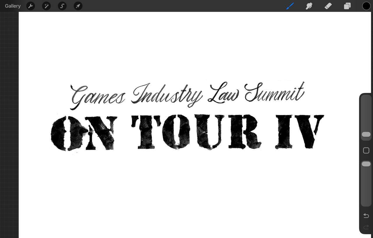
But we still felt the disconnect between the key art, and the lettering style.
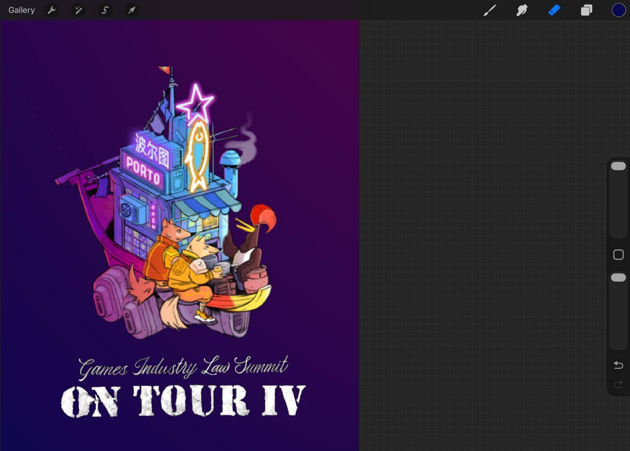
Around the same time, for the reason I cannot remember, we were doing some work with the Korean language placeholders, which gave us an idea to try it also with the Summit's art –
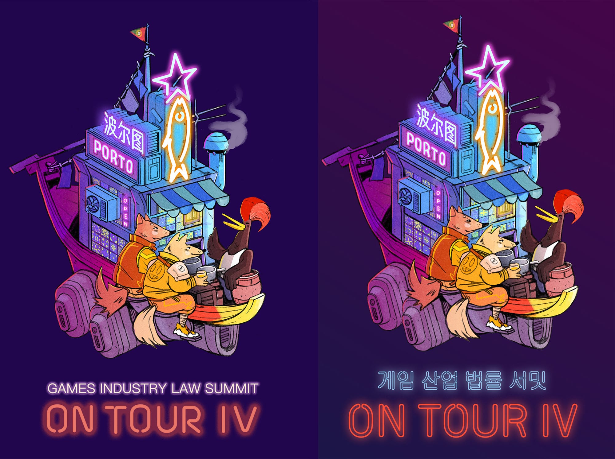
And we felt like it's a much better match: the neon signs on the boat, and the neon sign as the title; if the conference is 'the third place', then definitely a neon sign is a better reflection than a port stencil.
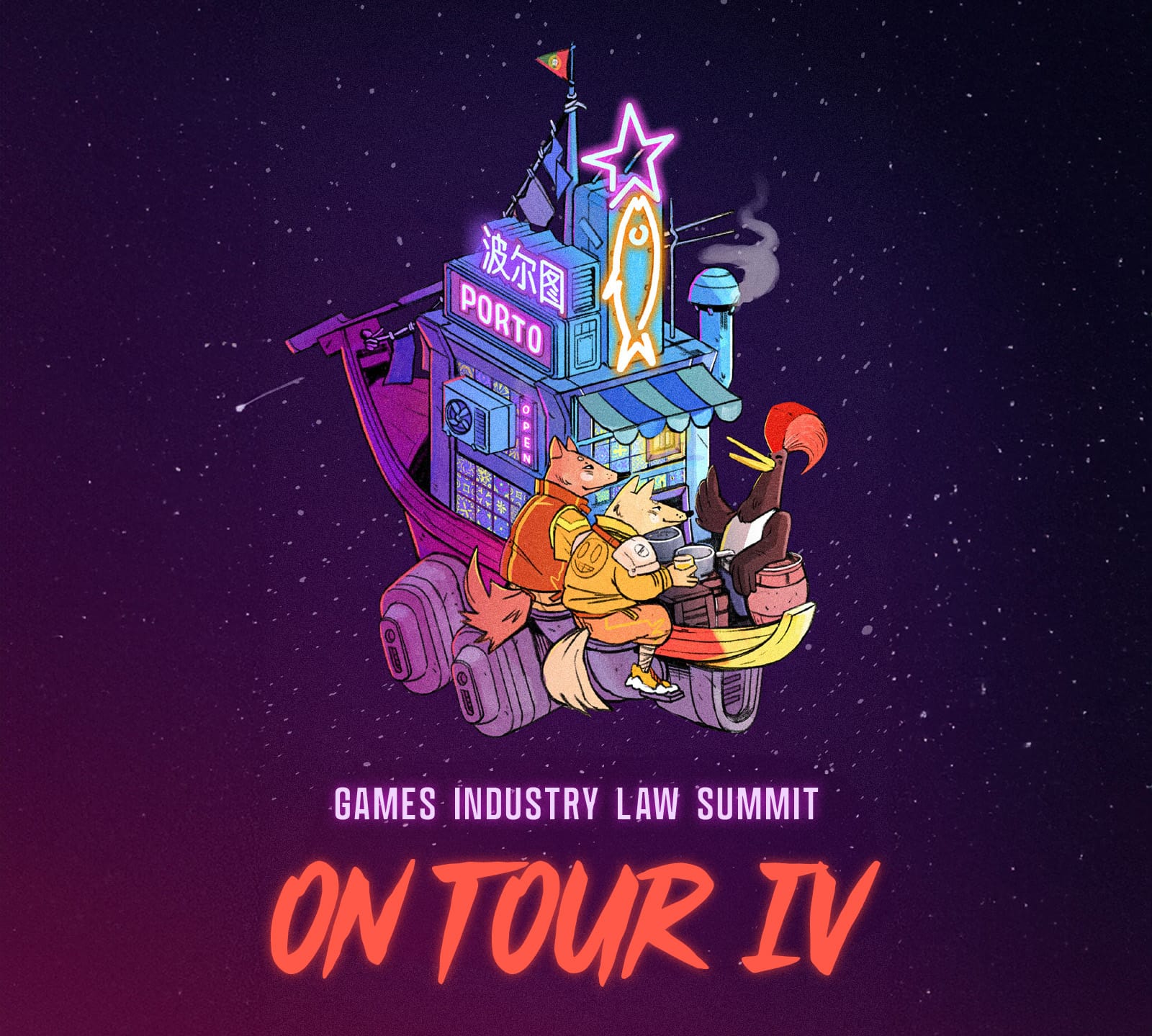
With one more step, we were able to complete the design: we placed the Rabelo cyber-boat in space, adding a bit of dynamics.
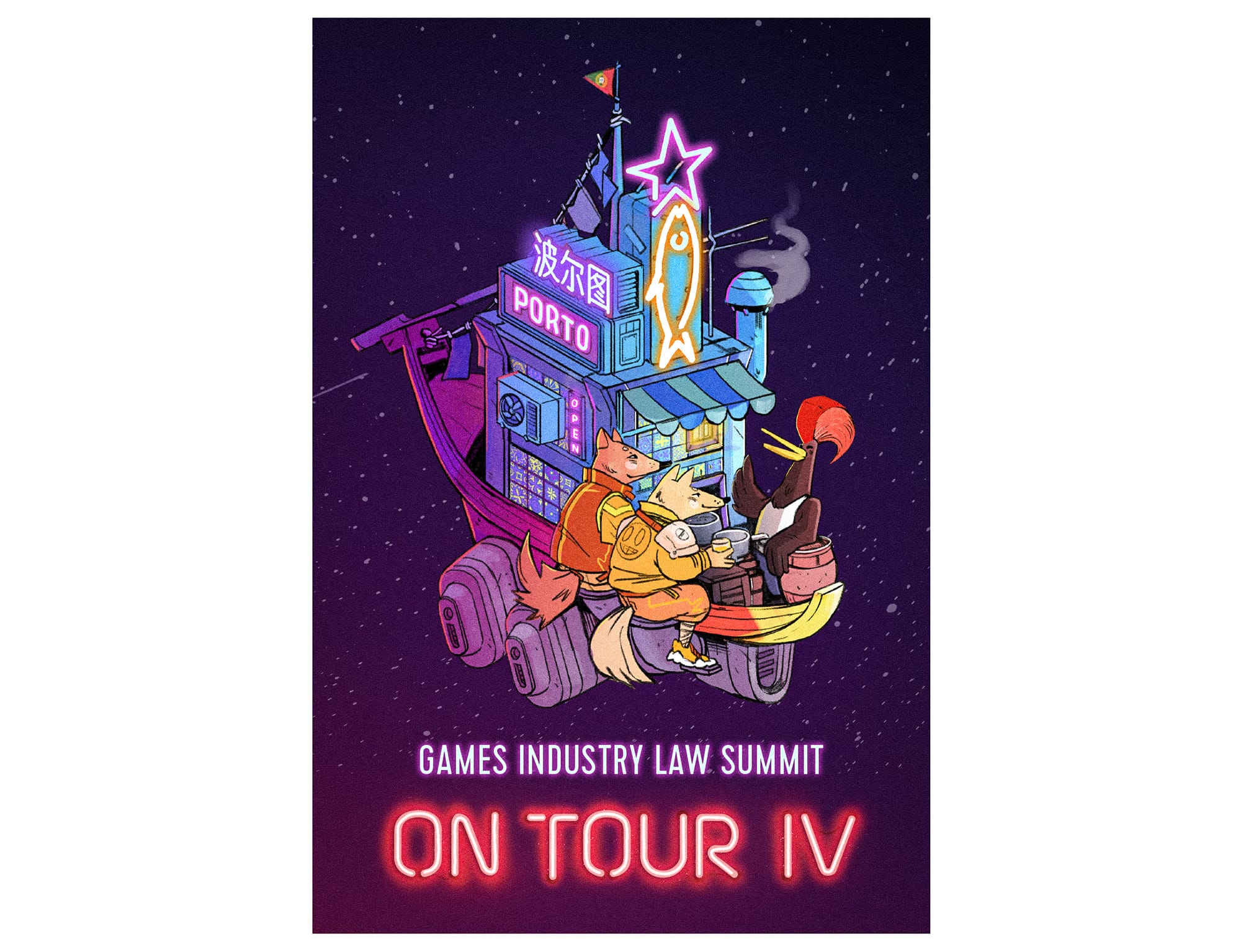
The Reality
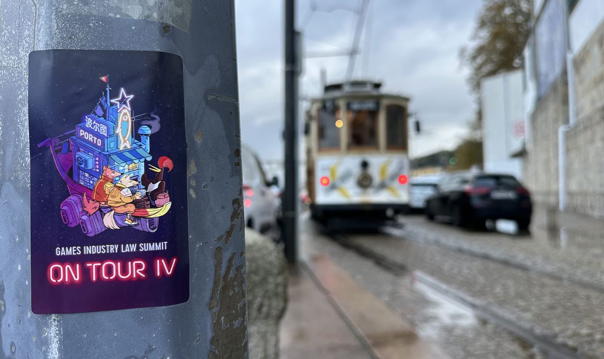
For a while, we were happy with the art. We produced a bunch of stickers, which we took to Porto (disclaimer: all of these were removed after the photographs were taken, no intent to pollute the environment).
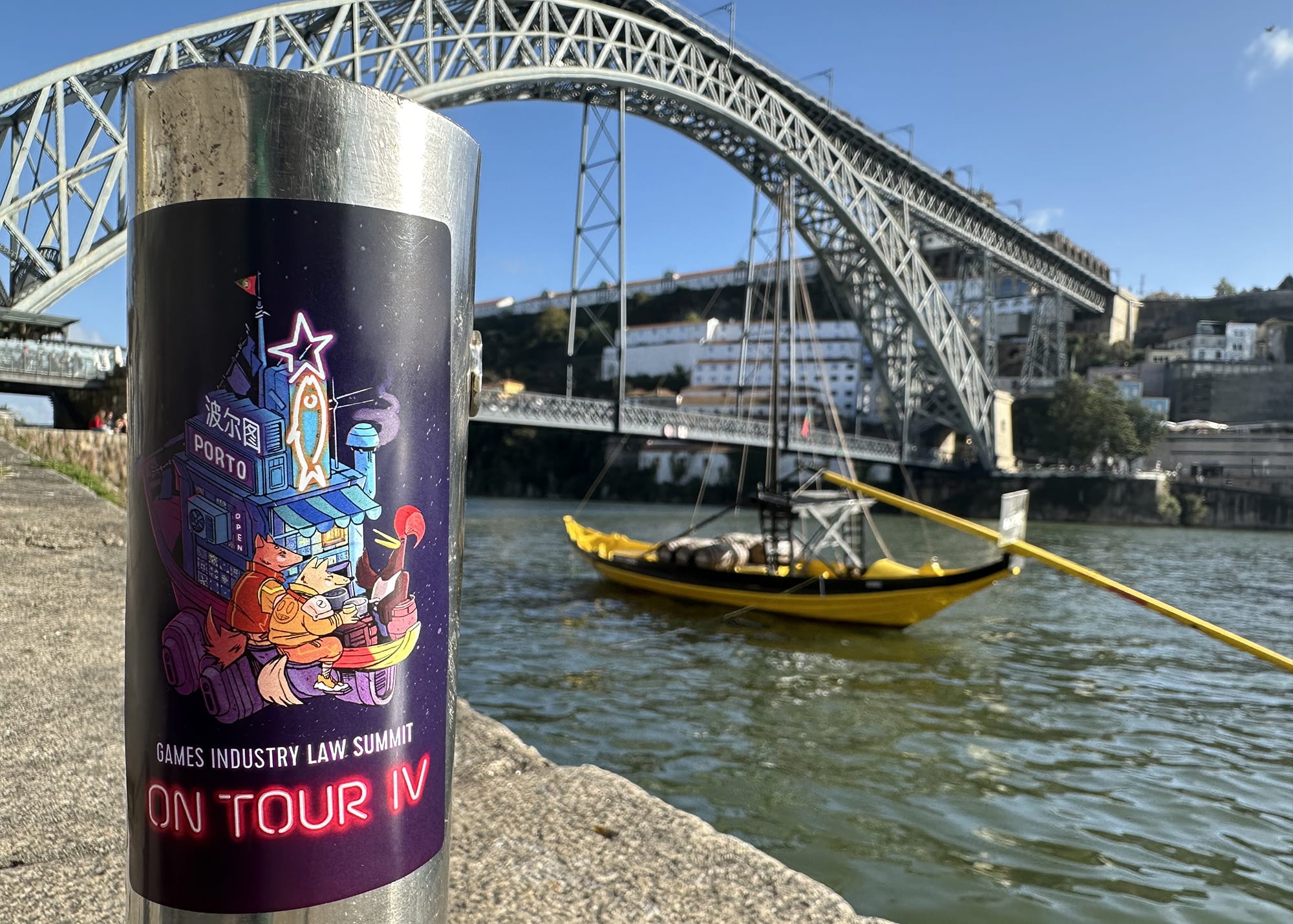
And introduced it in the Agenda of Summit XI in June. And yet...
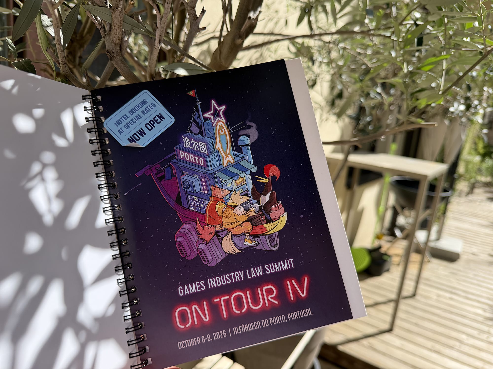
...and yet, like true indie developers, we failed to consider one aspect of our process: the manufacturing limitations of printing the attendee bags, and the notebooks.
In both of these formats, when tested, the 'neon logo' failed miserably 😜🙈🤪.
The Correction
The neon had to go. And because we switched to the natural, uncolored attendee bags from 2025 onwards, we needed a version of the logo that would work well against the beige as well as against the darker notebook cover.
After a bit of struggle, we settled on these for the prints –
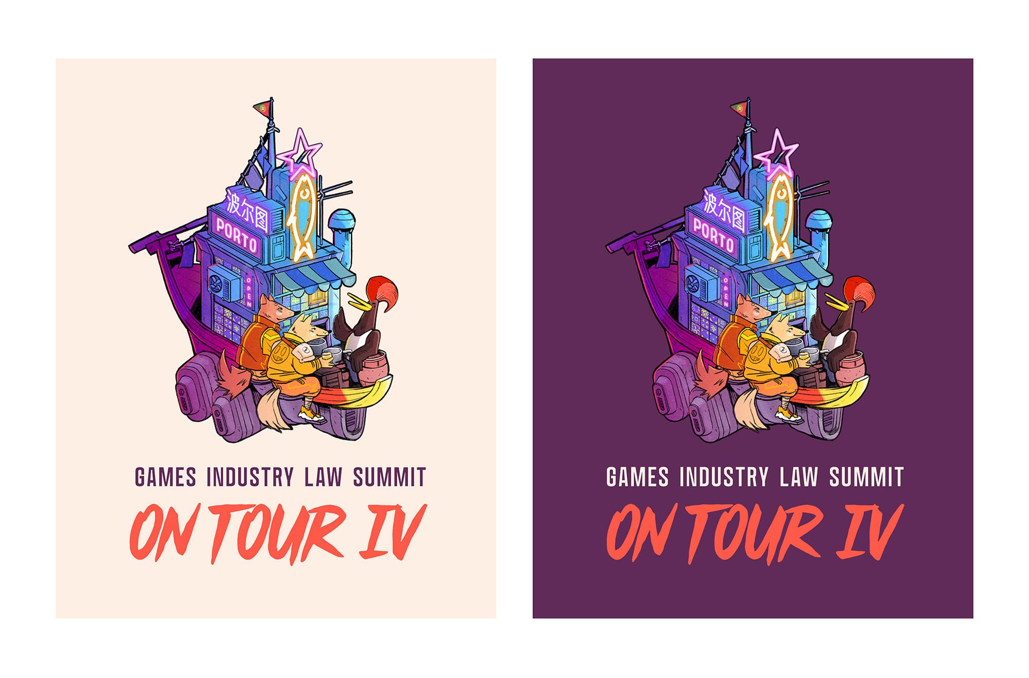
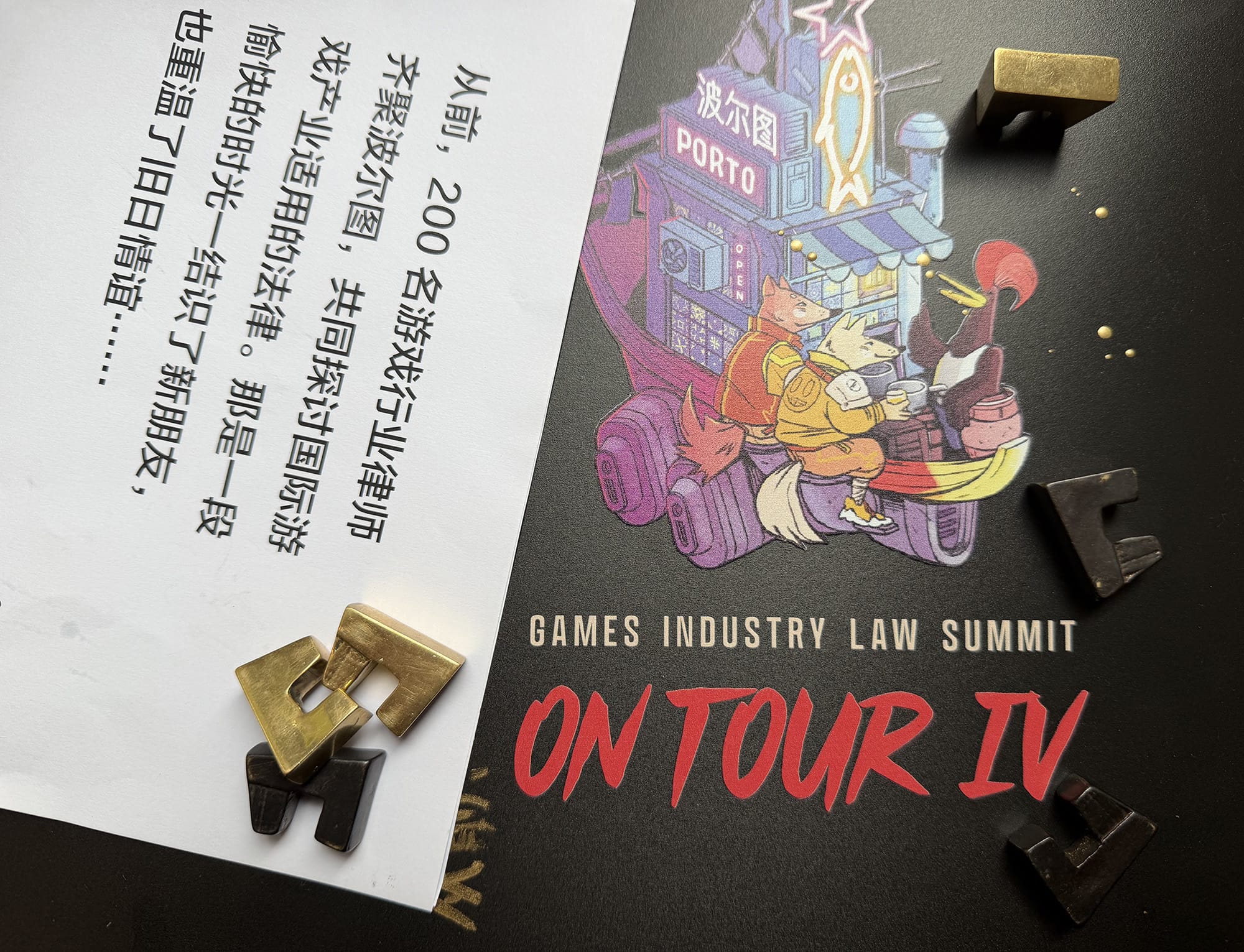
Meanwhile, the digital version (e.g. on the website) retains the space in the back:
And that's ii for the visual. Now, let's talk about the music.
お待ちかねのオフィシャル・ジングルの登場です!
The Jingle
As you may know, we started using conference jingles only this year, at Summit XI in Berlin, as a way to call the attendees for the next session on the agenda.
For this part, we work with Anna Fruit, a DJ and a composer who also creates the music and the sound effects for all of our studio's video games.
Now, we wanted 2 things from the Porto jingle:
- a theme that would pay homage to Portugal, while retaining the connection to the art – where we have 2 characters that look as cool as if they have just arrived on motorbikes (smiley jacket, etc.);
- a connection between the location (Porto) and the global mix of the community (where we opted for Porto's name in Mandarin to highlight it).
For the first point, our friends in Porto suggested a local band Xutos & Pontapés as the reference, and in particular their 1987 album 'Circo de Feras' (a song on YouTube: here).
For the second point, we asked our friends in Shanghai to give us a standard phrase that would play in a train that arrives to Porto, as in "Next stop: XXX". And what we got was: "列车前方到站PORTO站".
🥁 レディース・アンド・ジェントルメン,
please meet the official jingle of Summit On Tour IV:
We look forward to creating some good memories in the community, with this jingle playing in the background of the riverside venue 🤝.
And that's it for today.
それでは皆様、会場でお会いできるのを、チーム一同楽しみにしています。どうぞお元気で! More updates in the pipeline!
S|CO